It's A Wrap
- Category: Real Estate
- Published: Tuesday, 11 January 2011 10:51
 This week Scarsdale10583 is featuring a renovation of a local house by Scarsdale architects Deborah Goldreyer and Bart Hamlin. See how they converted an ugly duckling into a beautiful home and learn more about this innovative design team below.
If we are in the film industry, it means we’re finished shooting. If we are in the food industry, it means we’re serving Mexican. Since we’re in the home design industry, it means we are enlarging an existing house by taking all the new elements requested by the home owner and wrapping them around the existing house. This particular project, a residence in Scarsdale, NY started with a 1920’s house which had a good core but lacked the exterior charm of many old houses. So we wrapped it - like wrapping a dignified lady of approximately the same age with an elegant silk shawl.
We did not know, at first, that we were going to do a “wrap”. When first approached by the Scarsdale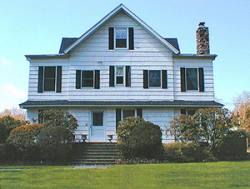 homeowners, we were told they had already been involved with an architect but not satisfied with the results. Some architects might have been tempted to say to themselves “that’s a wrap” and try to get out of the situation as fast as possible. Instead, my very talented design partner, Deborah Goldreyer, went to work. Every project is its own puzzle. From the very beginning, we knew this particular was going to be complicated.
The wrap emerged slowly. Our schematic design phase usually includes lots of different ways to look at the project. We juggle the project pieces, trying all kinds of combinations. Some we throw out quickly and others are kept as strong possibilities. Every project is unique and this one had some real challenges.
The existing first floor of the house had a beautifully detailed entry hall, lovely living room and delightful dining room. The flow of the original, center hall home worked well but the later additions did not work well at all. A small study with an awkwardly located powder room was too small for anything but a single desk and one small couch. The kitchen was stylistically challenged. The laundry/pantry addition completely blocked the view of the rear yard from the kitchen/breakfast area. A tiny family room off the kitchen was inadequately for large gatherings and accessible only through the kitchen.
The homeowners wanted to update their house with a new, more formal entertainment room, an attached two car garage, laundry room, mudroom, front porch and rear deck. On the second floor, they wanted a new bedroom suite so each daughter could have their own bathroom and dressing areas. On the rest of the property, they wanted a new pool and eventually convert their detached garage into a cabana.
 Site restrictions complicated the puzzle. The very large front yard had a utility easement crossing only 18 feet in front of the house thus eliminating the front for any major expansion. Since this was a corner lot, the side yard faced a street and therefore had a large setback requirement, leaving only 11 feet of building area in that direction. Also, the only viable location for the pool was at their current driveway, which would require relocating the driveway and building a new garage.
Existing house conditions kept the puzzle interesting, too. The very narrow rooms at the first and second floor to the left of the main gable were too small. Also, a previous, two story addition off the kitchen was so badly constructed that we had no choice but to tear it down. Luckily, the core of the house had good bones. We looked to the core, and the client requirements, to try and create the ideal solution.
Program logic called for the new mudroom/laundry/garage areas to be near the kitchen. The new deck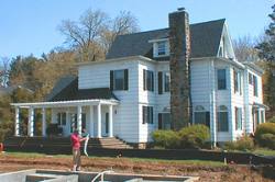 should be off the kitchen/breakfast area and overlooking the rear yard and pool. The new porch should be in front overlooking the large front yard and creating a more dignified entry. The family room needs to be off the entry hall because they wanted their friends to come into the room without going through the rest of the house. As we started laying this out, the project slowly sorted itself out into its current layout.
We worked on the facades at the same time as the plans. We always want our projects to function really well with great flow and spatial relationships. We also want our houses to look great. The existing, large front gable and the large roof soffits suggested a strong 3-dimensional character. Unfortunately, several additions over the years failed to pick up on this character. Since the program elements required almost doubling the footprint of the house, that gave us the chance to give the house a stylistic make-over.
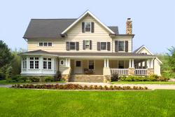
We started with the existing front gable and made that the focus of the front façade. A new, large porch stair was installed centered on the gable and this reinforced the formal entry of the house. The need to relocate the driveway worked well since all the traffic would be re-directed to the front thus eliminating the previous confusion regarding how to find the front door. The driveway then continued around to the back of the house where the everyday functions were grouped together. This arrangement appropriately separated the formal, front entry from the functional back door as well as away from the pool and deck. With the kids reaching driving age, we located additional outside parking at the new back door. Extending the front porch to this back entry created the warp-around porch and helped continue the “old house” aesthetic.
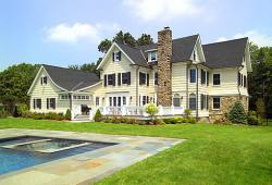
The “wrap” layout was taking shape. We continued using the new project components to further define a consistent aesthetic and massing. We looked to the roofs and base to give a strong overall organization to the outside appearance. Stone dug from within the property was used to create a consistent masonry base around the entire house and for the main entry stair and side walls. Along the porch, the stone rose up as piers to hold up the multiple columns. The stone continued as the base of the garage and deck. At the family room, the stone rose to the height of the entire first floor thus giving the entertainment room, with bedroom above, a strong presence from the side street. Then the stone dropped down again and was replaced with windows and wood detailing to create the bright, airy effect of the sunroom portion of the entertainment room.
All the new roofs took their cues from the original roofs: New roofs were all pitched; In addition to the roofs, the massing of the new components was studied carefully. The front gable gave the house a formal focus. The mass was then broken down by adding the one story porch and sunroom. This allowed the larger reading while also offering a smaller, personal scale. In the back, the massing was designed to feel like successive additions which reduced in size from the main house roof to the bedroom roof gables to the garage roof to the horizontal laundry windows and finally to the deck.
Altogether, the design created a unified aesthetic for the entire house inspired by the best design elements of the original structure. Major credit goes to the homeowners for their serious interest in good design and their extreme patience. They actually lived in the house during construction.
At one point early on, the entire perimeter was excavated like a moat. As with all good castles, every moat gets a drawbridge. Every day, the drawbridge was raised and lowered to accommodate to comings and goings of the homeowners while not disturbing the work of the masons and carpenters. Work and home life co-existed while the house received its extreme make-over.
Eventually, the drawbridge disappeared, the construction came to an end, the plantings were in and the homeowners actually could relax and enjoy their newly expanded home.
And that, as we architects say, is a wrap.
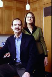 Architects Deborah Goldreyer and Bart Hamlin met at Columbia University Graduate School of Architecture and have been designing together ever since. They moved to Scarsdale in 1990 and have raised two children here. Their current partnership began in 1991 after numerous Scarsdale neighbors asked for help with home renovations. Deborah and Bart pride themselves on providing high quality design and professional services and they have kept very busy for the past twenty years working in Scarsdale and surrounding towns in NY and CT. They design new homes, renovations, additions and interiors. They provide a full range of services from feasibility studies through construction phase administration. They delight in contextual design – working the new house or addition until it feels perfectly at home with the neighborhood or the existing old house – while providing all the luxuries of our current life style.
Aside from their architectural business, Bart and Deborah are involved in other community activities. Both are involved with the New Choral Society, him as a baritone and her as a volunteer. In addition, Bart is currently Chair of the Conservation Advisory Council, a Director of the Scarsdale Community Center, and President of Tri-County Basketball League.
Their favorite testimonial is from a client on Brewster Road who said, “You treat my home as if it is your own!”
Visit their website to see more of the team's work.


